TWA Posters – Vintage Airline Posters

The travel and tourism industry, including major airlines, used vintage posters to sell dreams to the public and thereby poster artist designed some of the most iconic and fantastic vintage posters.
TWA posters are amongst the most sought after airline and travel posters. Other airlines which extensively used posters for advertising included United Airlines, American Airlines, Swissair, and Air France.
The History and Style of TWA Travel Posters
The travel posters produced during the 1950s and 60s were highly effective in inspiring the public’s desire for travel. In 1958 more than one million passengers had flown from America to Europe – which for the first time was more than the number of passengers who had travelled by ocean line.
It was the golden age of travel and travel posters were key components in this development. One of the main airlines to contribute to the increased interest in and access to travel was Trans World Airlines, or TWA.
Trans World Airline’s effective branding and advertising attracted passengers to international and domestic travel. The airline is well known for its creation and use of some of the most iconic and striking travel poster designs of the time period.
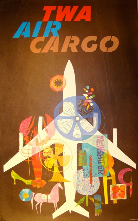
David Klein, TWA AIR CARGO (1965)
The History of TWA
TWA was first established in 1929 as Transcontinental Air Transport (TAT). A year later it went on to merge with Western Air Express, forming Transcontinental and Western Air, Inc. (TWA). In 1939 the famous millionaire Howard Hughes attained a majority share in TWA. This purchase was a significant turning point for the airline and the direction of its branding and advertising.
In 1950, Hughes had the airlines name changed once again. This time it was changed to Trans World Airlines (TWA) which is what it remained until its closure in 2001. Howard Hughes had significant Hollywood connections, and this gave the airline a newfound high-class celebrity status.
This luxurious star status combined with the airlines successful, signature advertising hugely contributed to the early success of TWA. Throughout the 1950s and 60s TWA continued to be the first choice of airline for celebrities which helped keep the airlines seats constantly full of passengers.
![]()
Unknown Artist, TWA Complete Air Transportation (1933)
The Posters of TWA
The glitzy reputation of TWA was echoed through their branding and advertising. Only high-quality design was accepted and used. The airlines travel posters captured the high-class allure of luxury travel in one single enticing image. Their preferred style of design was attention-grabbing, minimal use of text, and focused on high-quality illustrations.
These highly persuasive travel posters were found in cities all over the world. They were placed in airports, railway stations, hotels, travel agencies, and airline ticket offices. They successfully served as beautiful, persuasive promotion for the public.
After World War Two, there was heightened competition amongst airlines. New companies had emerged and the desire for air travel exploded. It was through enticing and bold branding and design that airlines could differentiate themselves and succeed.
This fierce competition amongst airline companies created a surge in the demand and the production of travel posters. Airlines used these travel posters to graphically create and present an image of themselves to the public. TWA secured good public opinion through exceptional design and its association with luxury and the celebrities of the time.
During this same post-war period several specialty graphic design firms emerged. Their designers saw the new air flight service as exciting unexplored terrain. This is the reason the graphic design produced through these airline travel posters is so strikingly free, bold, and innovative.
The job of travel poster designers was to create strong and appealing imagery to promote the idea of a safe and magical experience, all while contributing to the education of the the public in the grammar of visual communication. TWA achieved this with the help of various expert designers, but definitely the most significant was David Klein.

David Klein, SAN FRANCISCO—Fly TWA Jets (1958)
The Work of David Klein for TWA
David Klein (1918 – 2005) was responsible for the creation of many of the best posters TWA ever produced. He created dozens of posters advertising travel throughout the United States and abroad for TWA during his time with them between 1955 and 1965.
These travel posters are now artistic icons of America’s “Jet Age”. TWA accredits Klein with establishing the notion among Americans that ‘seeing the world meant flying TWA’. His bold, attractive posters had the ability to inspire wanderlust by highlighting the joy and fun of travelling.
Klein was a natural illustrator and his early career consisted of him working as an illustrator for the U.S. Army and as an art director for a theatrical advertising agency in New York. He quickly achieved great success through his commercial work and became well known in the late 1940s and early 1950s for his Broadway show window cards and posters.
He then went on to achieve even greater success from his travel posters for TWA. He excellently promoted global travel through the use of bright colours, the incorporation of iconic landmarks, and the portrayl of highly scenic images. Another key feature of his TWA travel posters, and many other iconic travel posters, is the minimal use of text.
Travel posters were focused on the imagery that would capture the viewers’ attention and imagination rather than being an overloading of information. Klein’s posters defined a destination with a recognizable icon and bold typeface. This was a winning combination and his abstract drawings and poster designs for TWA won many excellence awards.
Klein became a member of the California Watercolor Society in the 1930s. His travel posters emanate the style closely associated with the group – bold colours and thick brushstrokes applied to paper without any pre-planning. These bright and abstracted illustrations of Klein’s became iconic to both himself as a designer and to TWA as a brand.

David Klein, LOS ANGELES —Fly TWA Jets (circa 1960)
Iconic TWA Travel Posters
One of the most popular poster’s that Klein designed was the 1956 New York City poster (see below). This poster perfectly captures the excitement of one of the greatest tourist destinations, Times Square, in vivid colours and bold geometric shapes. It is a striking display of Klein’s love and mastery of colour, simplicity, and optimism in design.
It is considered a true work of art, confirmed by the fact that New York’s Museum of Modern Art added it to its permanent collection in 1957. This highly popular poster has been reprinted three times and the first printings of this poster with the Constellation often sell for more than $10,000. Two versions of this poster exist with the difference being the depiction of the jet above the poster’s typography – the early version portrays a Constellation and the later posters a minimal blue jet to advertise the new age of jet airplanes.

David Klein, NEW YORK—Fly TWA Jets (1950s)
The poster below that Klein created to advertise travel to Rome won the American Society of Travel Agents (ASTA) travel poster contest in 1961. The lithograph depicts the Roman Coliseum and the Vatican along with one of its Swiss guards who is in full regalia.
Typical of TWA posters and to Klein’s design style, text is kept to a minimum and an airplane can be found flying overhead. It is a classic example of Klein’s playful approach to design and illustration. It has his trademark bright, rich colours and iconic simplification of landmarks into easily identifiable geometric representations.

David Klein, ROME—Fly TWA Jets (1960)
A great example of a domestic TWA travel poster is the design Klein created to advertise St Louis (as seen below). The composition of this particular poster is incredibly striking in its simplicity, abstraction, and texture. The way Klein sets the St. Louis Gateway Arch against a festively patterned background emphasizes its momentous size.
The bright analogous play of colours, the iconic overhead airplane, and the inclusion of a stylised landmark (the old courthouse) perfectly captures the spirit of St Louis and of Klein’s style making it a truly iconic travel poster of its time and of Klein’s graphic design style.

David Klein, ST. LOUIS—Fly TWA (circa 1955 – 1965)
TWA’s Lasting Impact
Unfortunately, TWA was forced to declare bankruptcy in January 2001 for the third and final time. The airline was bought by American Airlines, but TWA’s design legacy endures even after the closure of the airline.
TWA’s travel posters evoke a time now considered as the golden age of flying. This is greatly attributed to the bold and enticing designs of David Klein. He helped TWA graphically establish themselves as a high-end travel company.
Travel posters emerged with the intention of inspiring the desire for adventures in faraway places. TWA achieved this over and over again and created posters that have stood the test of time and contributed to aesthetics of visual communication.
The other airline posters covered in our Vintage Airline Poster Series are about
Swissair posters. and
If you want to find out more about airline vintage posters or if you are looking to buy a stunning original airline poster, check out these poster galleries and collectors listed on aproposter.com:
-by Jessica Davies-
Images from davidkleinart